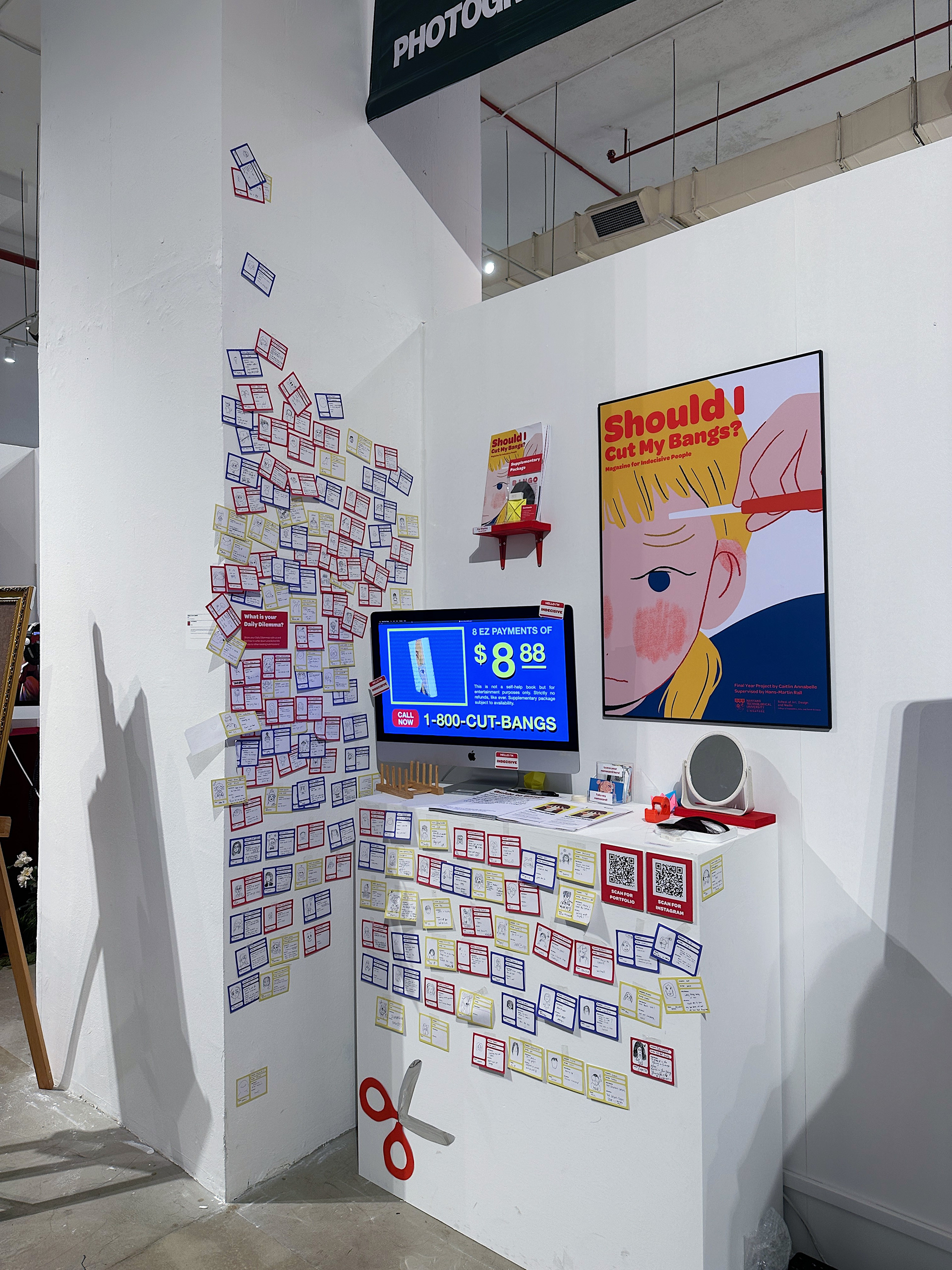
Should I Cut My Bangs? is an illustrated lifestyle magazine for indecisive people made by an indecisive person, aimed to inspire fellow indecisive poeple to embrace the uncertainties of day-to-day life!
Background
My FYP concept aims to poke fun at the collective experience of being indecisive.
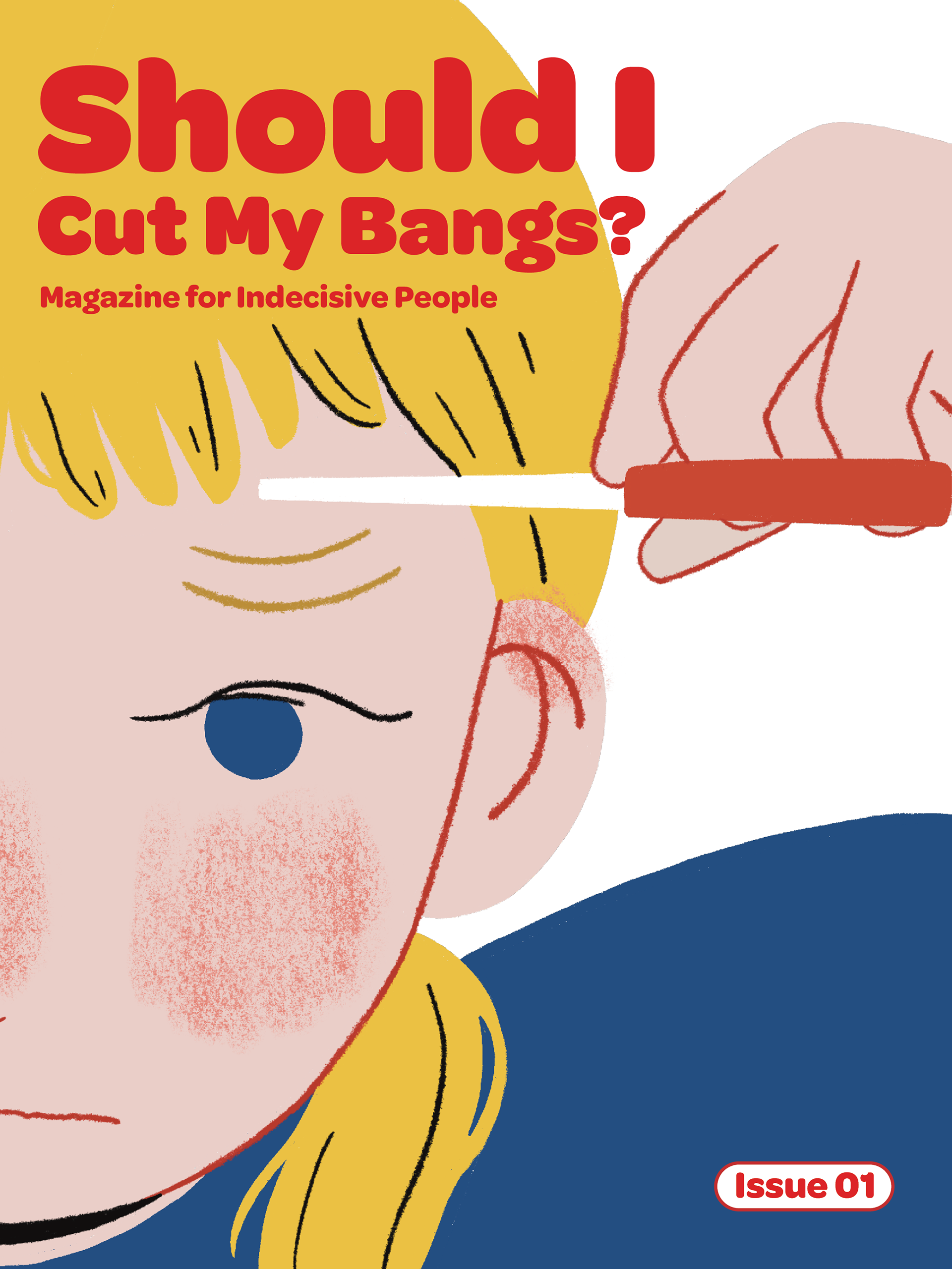
The act of cutting one’s bangs is commonly associated with indecisiveness and impulsivity, which are seemingly two opposite ends of a spectrum when it comes to decision making. However, they both share a common ground of being dysfunctional responses to decision-making related difficulties.I thought that having ‘Should I Cut My Bangs?’ as my final year project title could further encapsulate the wide spectrum of the difficulty of decision-making.
To further convey the idea of indecisiveness, I decided to have a variation of art styles for the illustrations and layout throughout the various sections of the magazine. I wanted added emphasis that this magazine was made by a fellow indecisive person, as I seemingly could not decide on a singular visual language to stick to throughout the magazine. However, in order to avoid the magazine from looking clunky or disjointed, I decided to stick to an overarching art direction so that the magazine can still be seen as a cohesive piece of work.
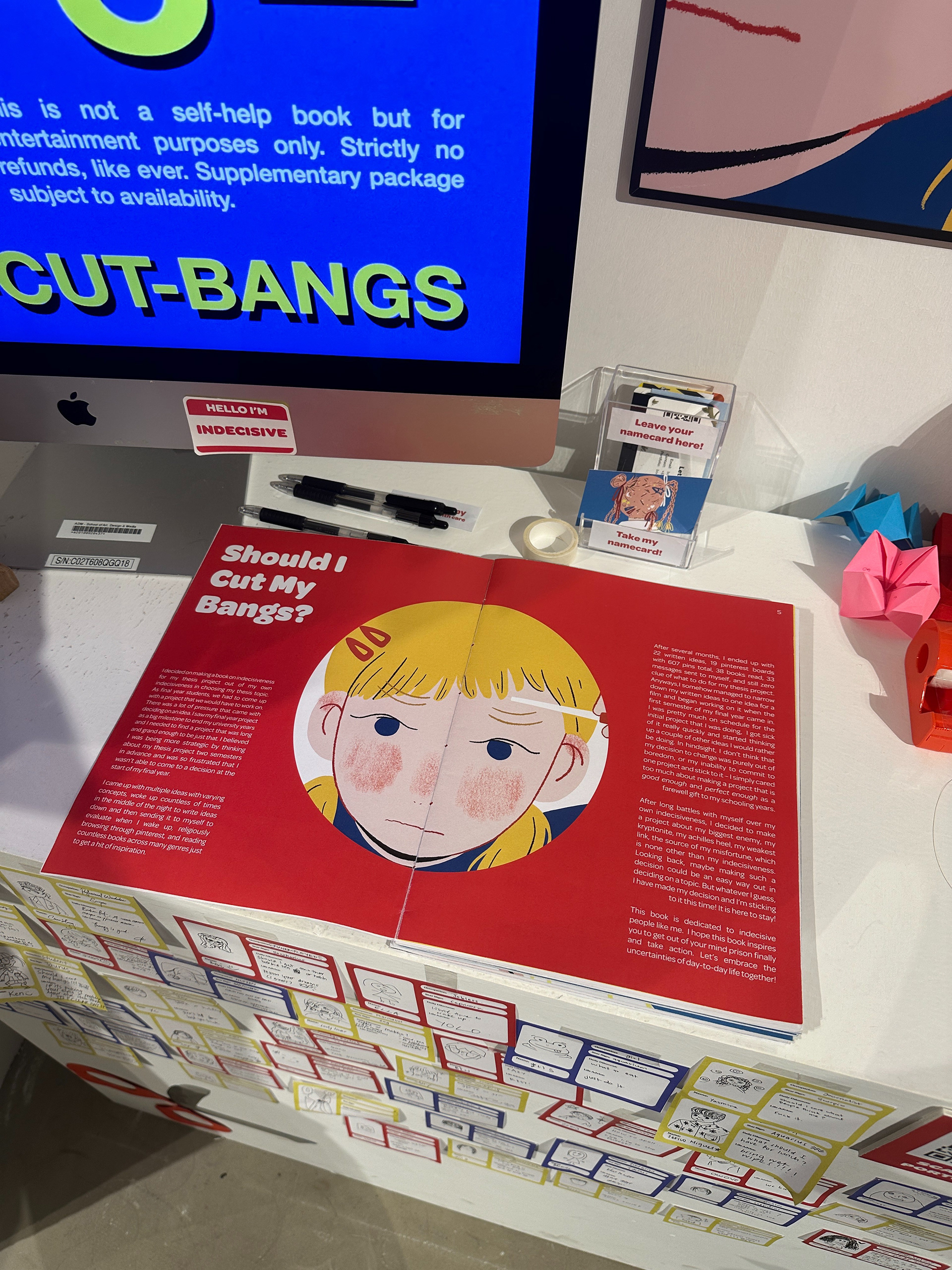
Introduction
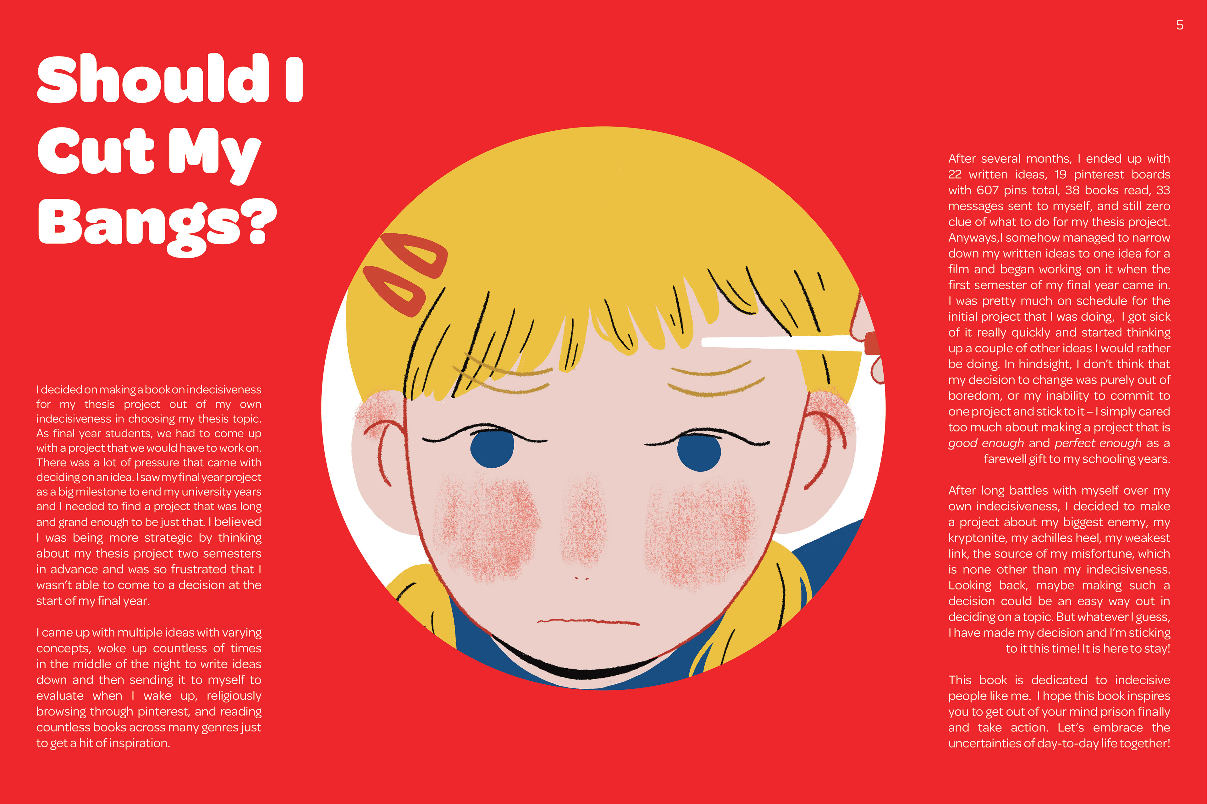
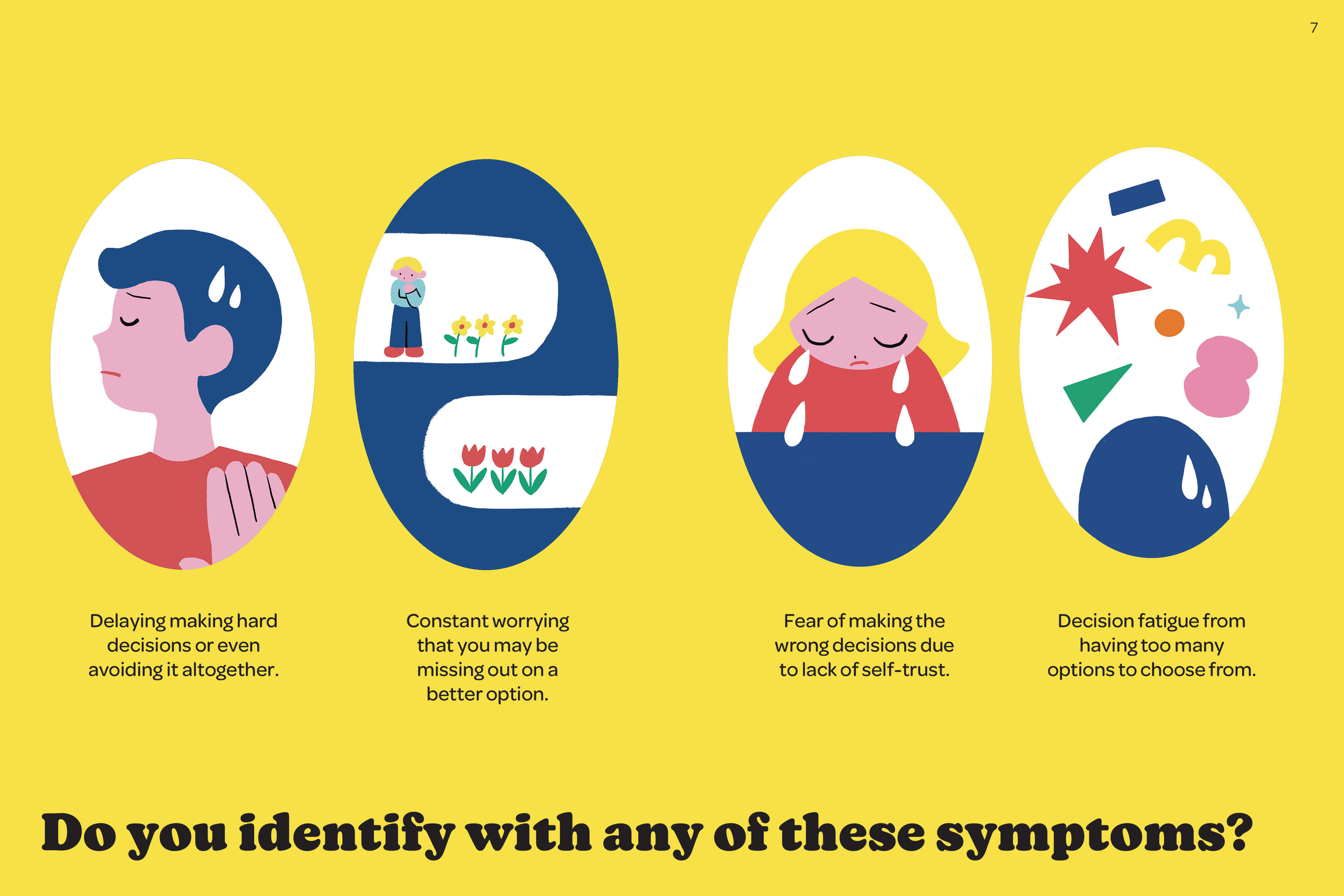
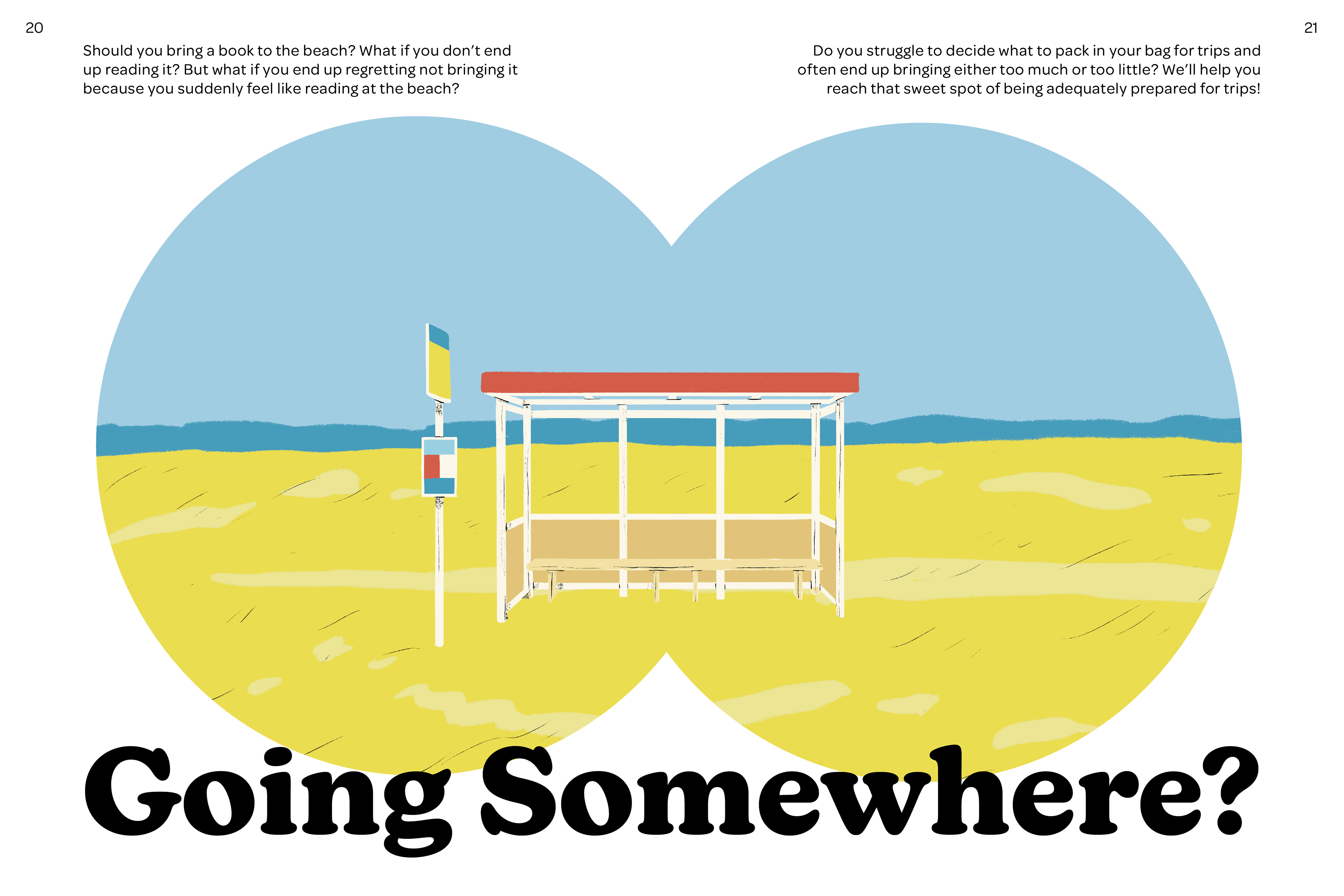
For the introduction section, I wanted to convey a neutral and objective stance on the topic before going into the other sections of the magazine. I thought that a simple and minimalistic art style would be more suitable, with a colour palette that was more dominated by primary colours.
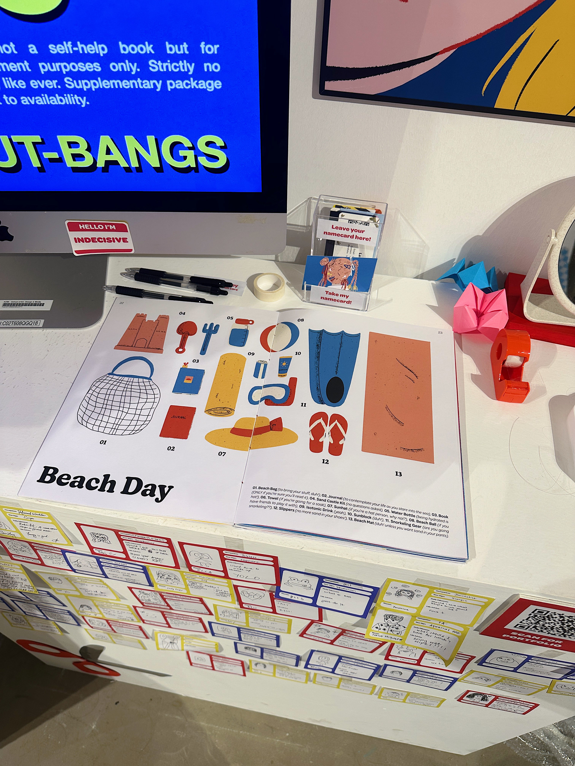
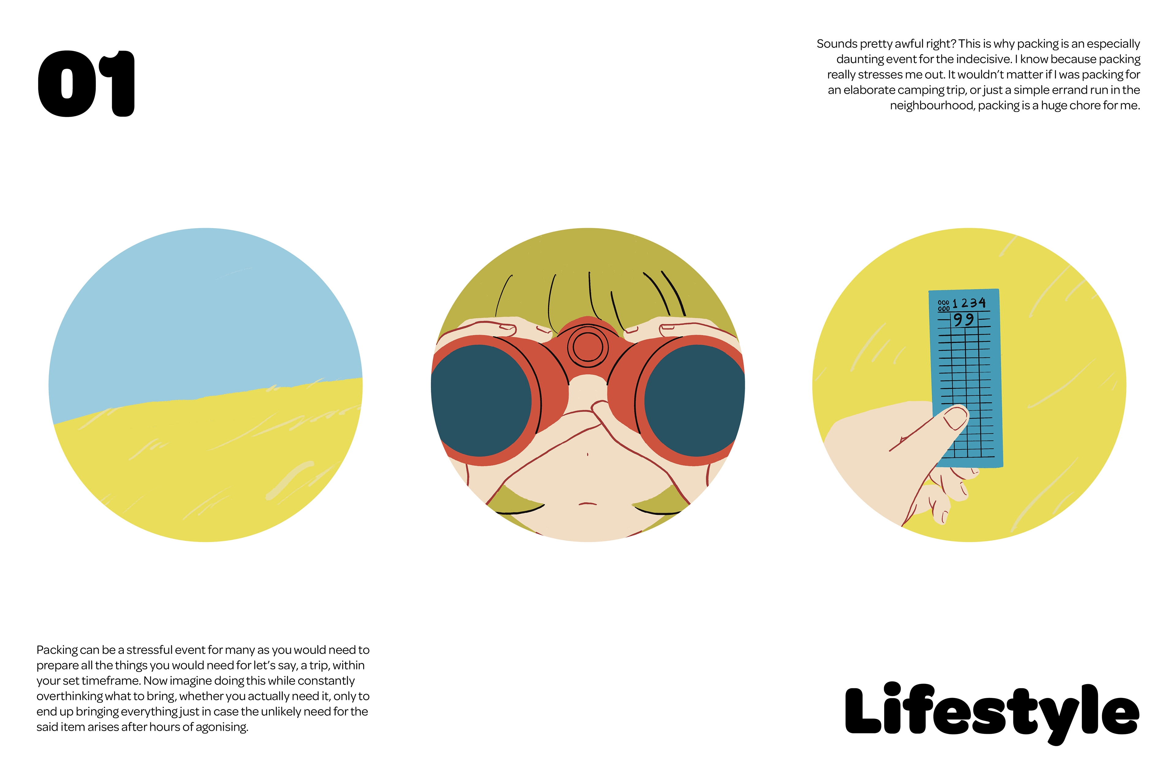
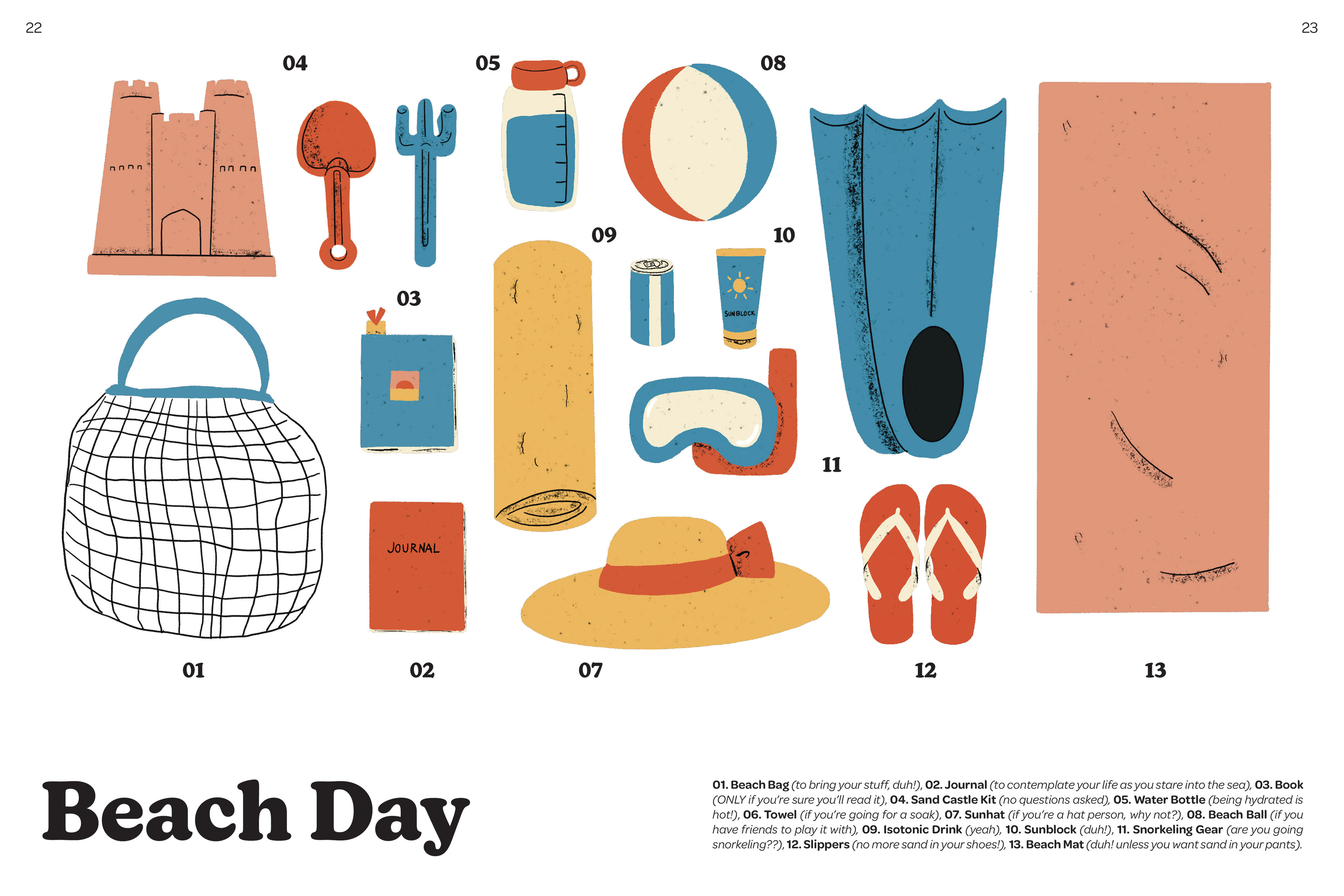
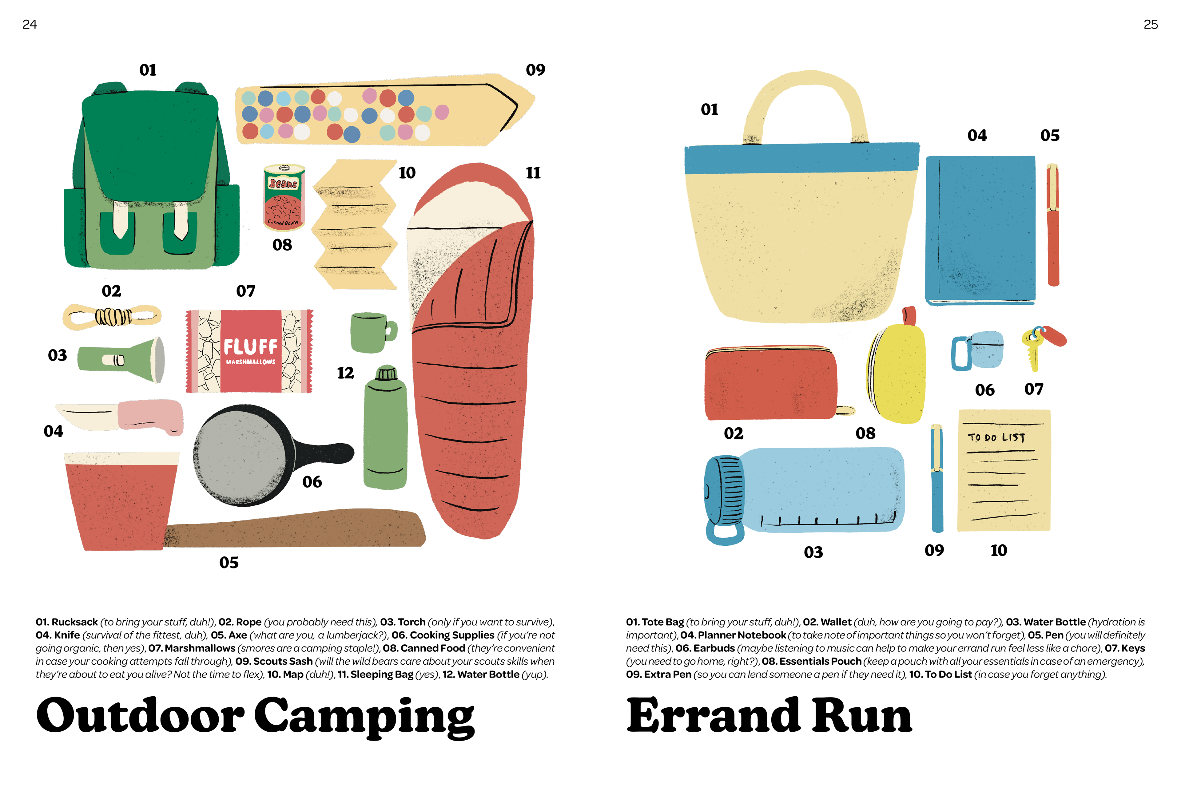
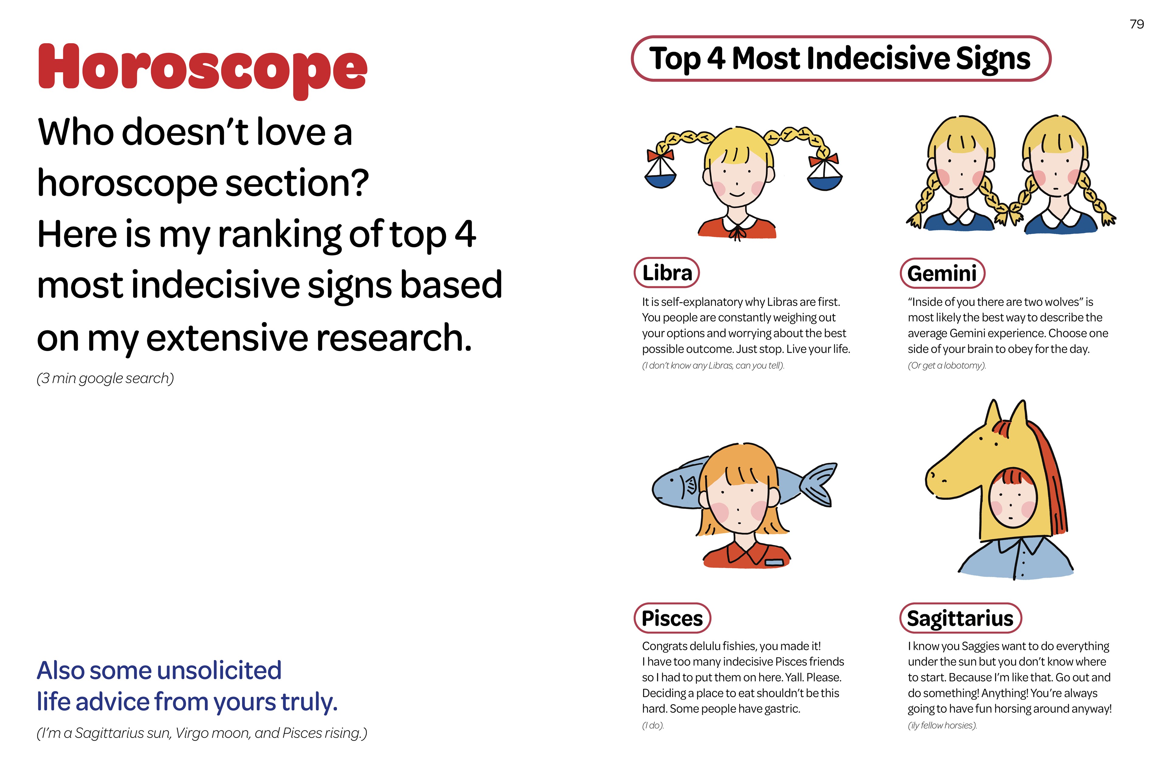
1. Lifestyle
The lifestyle section of the magazine consists of a guide to packing for different occasions. Due to packing being an understandably stressful and burdensome task, especially for indecisive people, I wanted to have a more clean and minimal layout, so as to not further overwhelm. The layout for these spreads are mainly in neutral black and white with the illustrations cutting through the pages with vibrant colours.
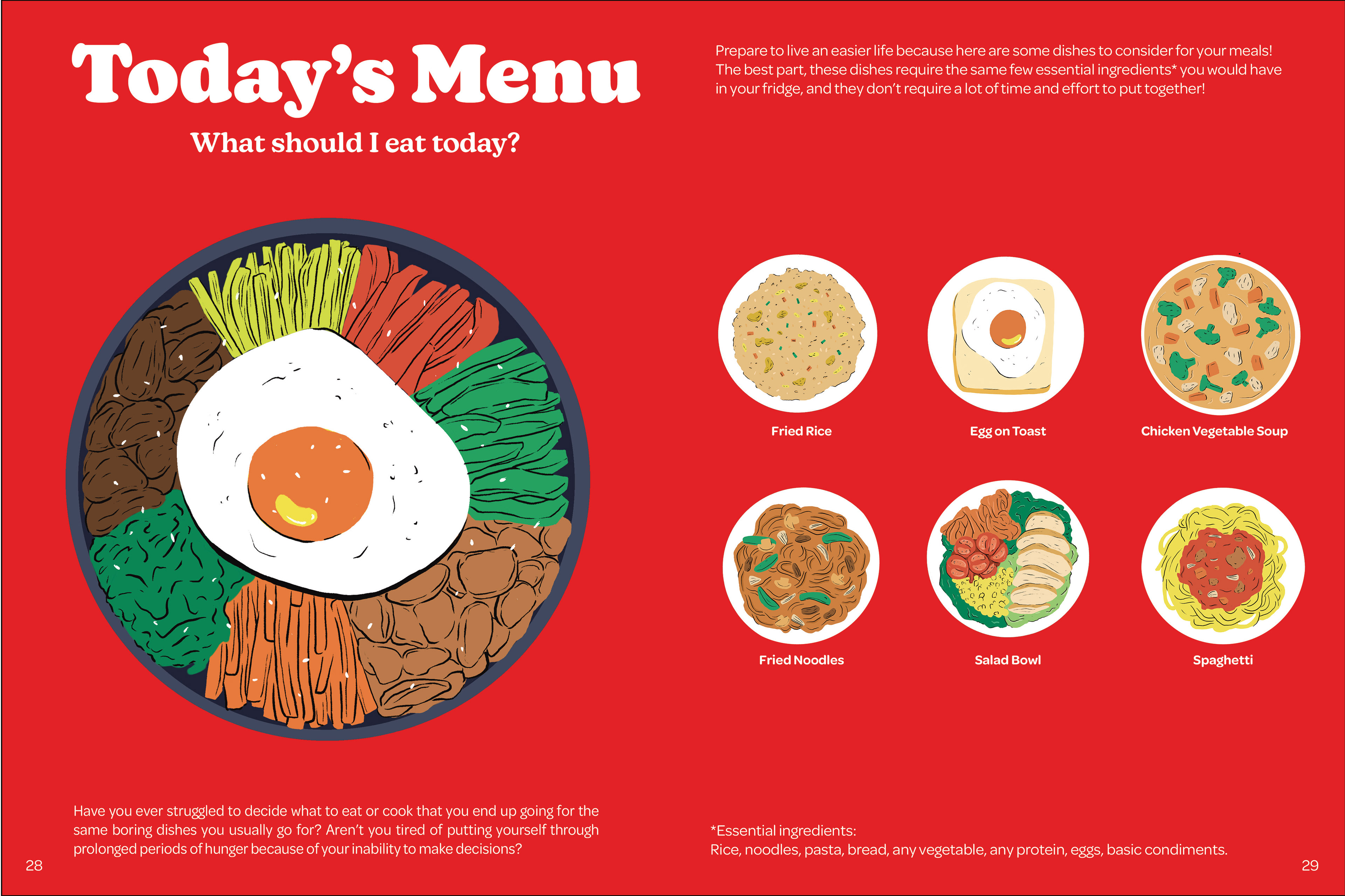
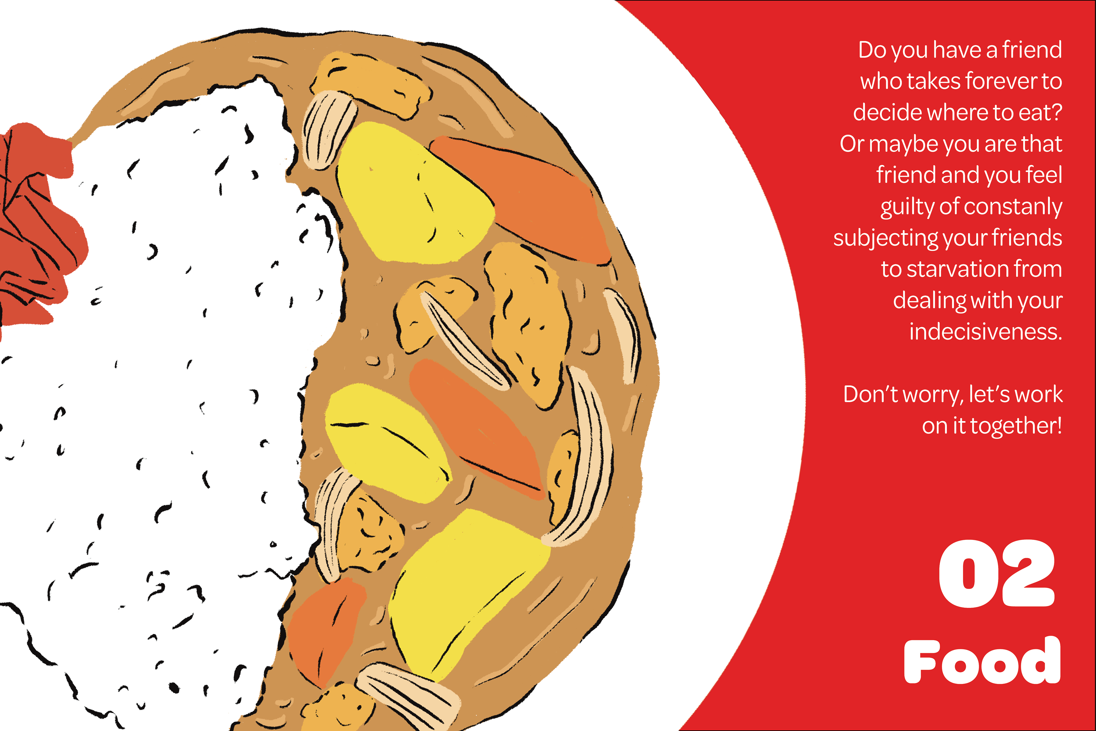
2. Food
I went with two art directions with the first one being inspired by nostalgic food menus in the past, with the ‘Today’s Menu’ spreads being dominated by red.
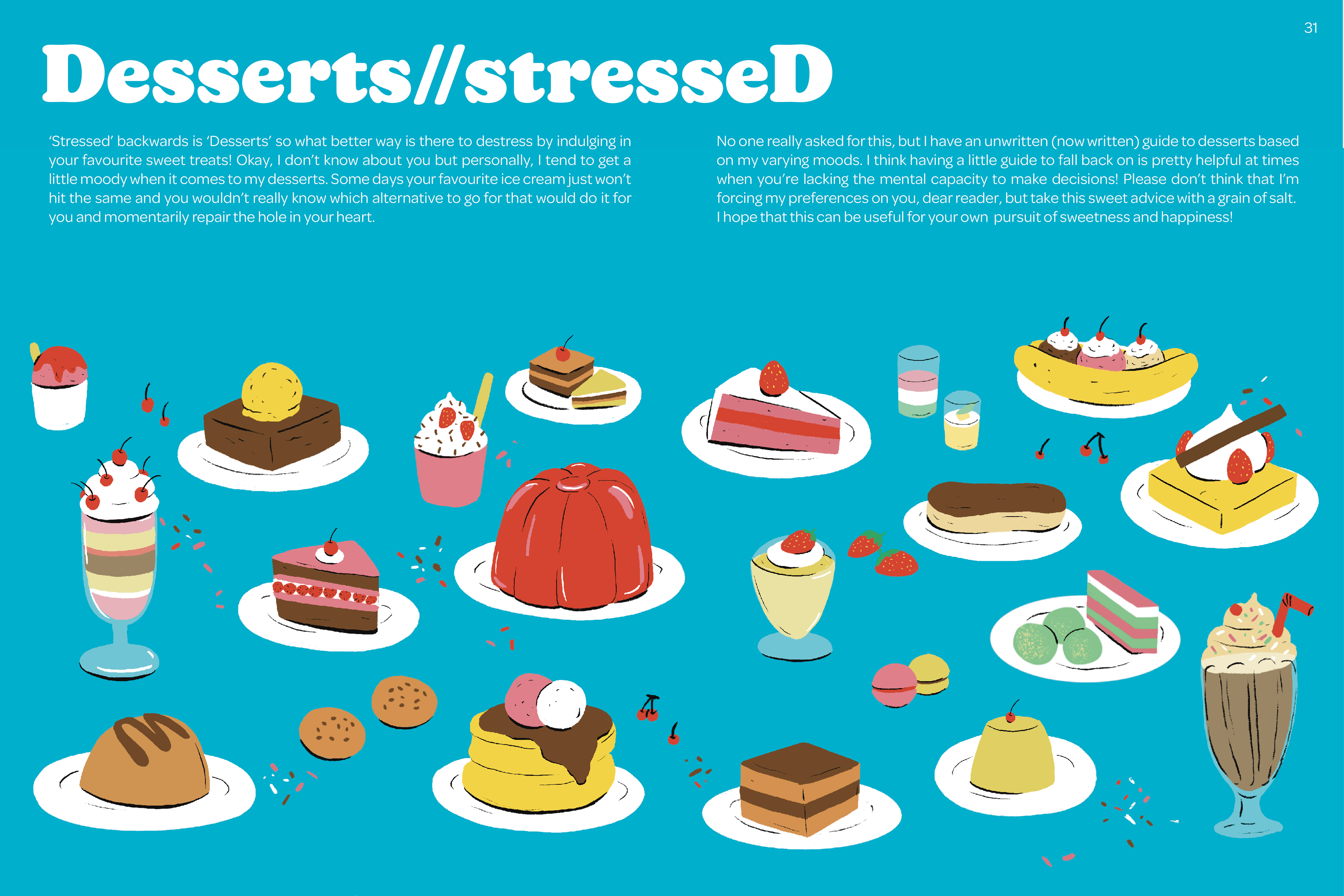
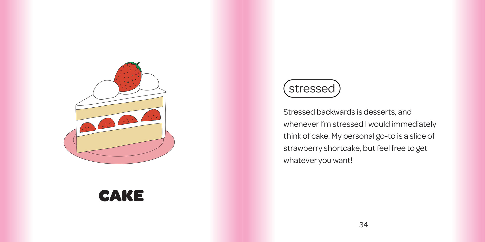
The desserts section was made to have cutesy, girly colours with a colour palette dominated by pink and blue. I wanted to illustrate the struggle of indecision due to having too many choices so I went with a more maximalist direction with a spread filled with desserts as the backdrop for the miniature menu booklet that is bound to that page. I added the small booklet as a solution to the dilemma of choosing which dessert to get with a more minimalistic look to contrast against the maximalist backdrop.
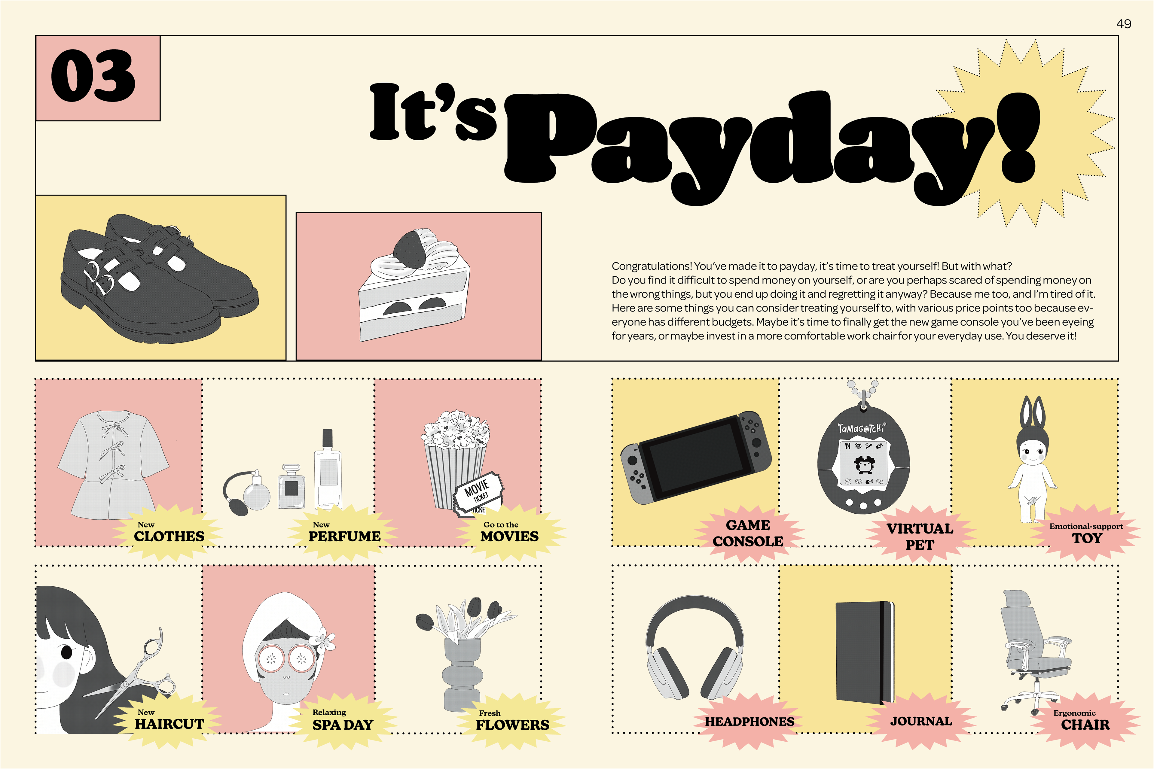
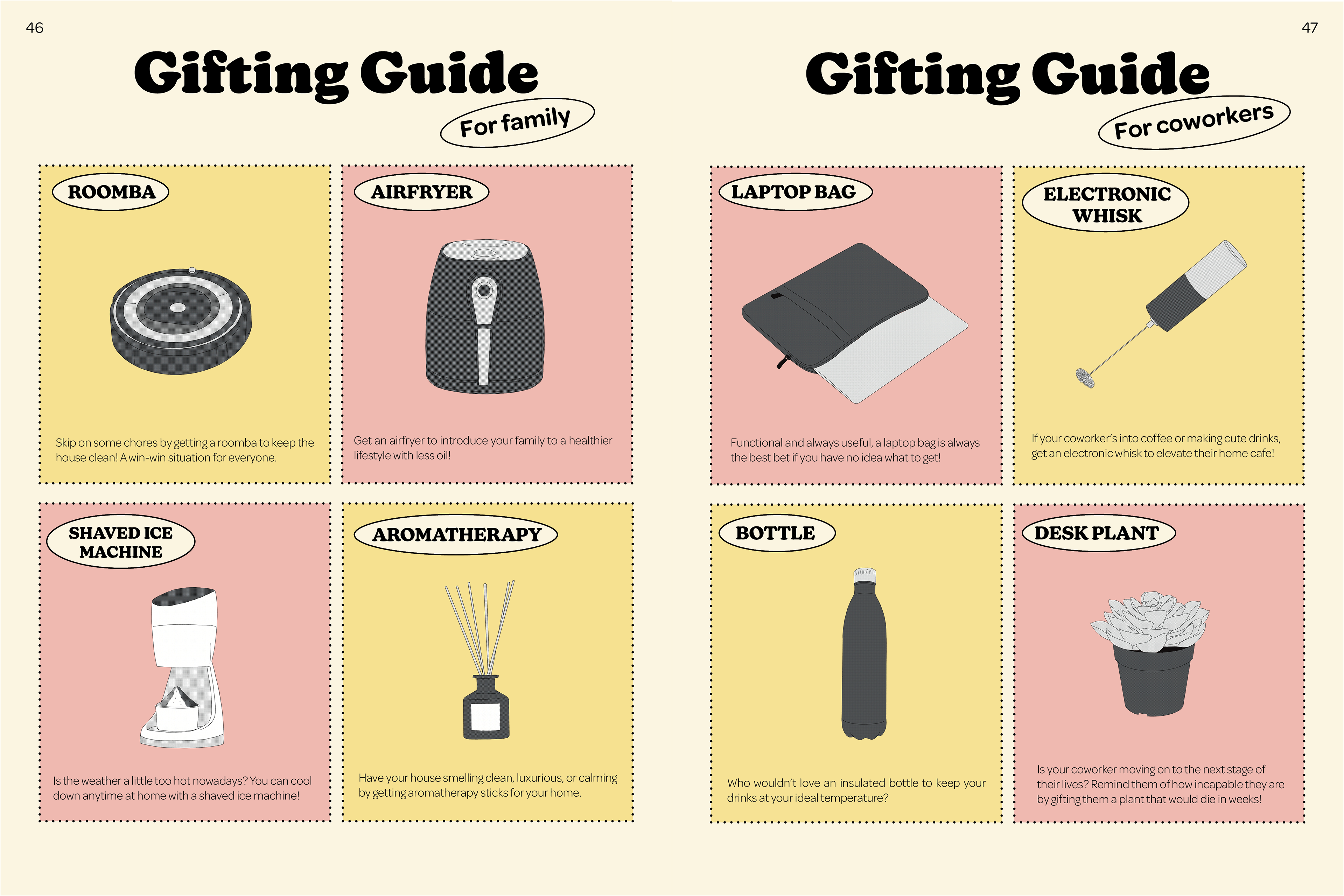
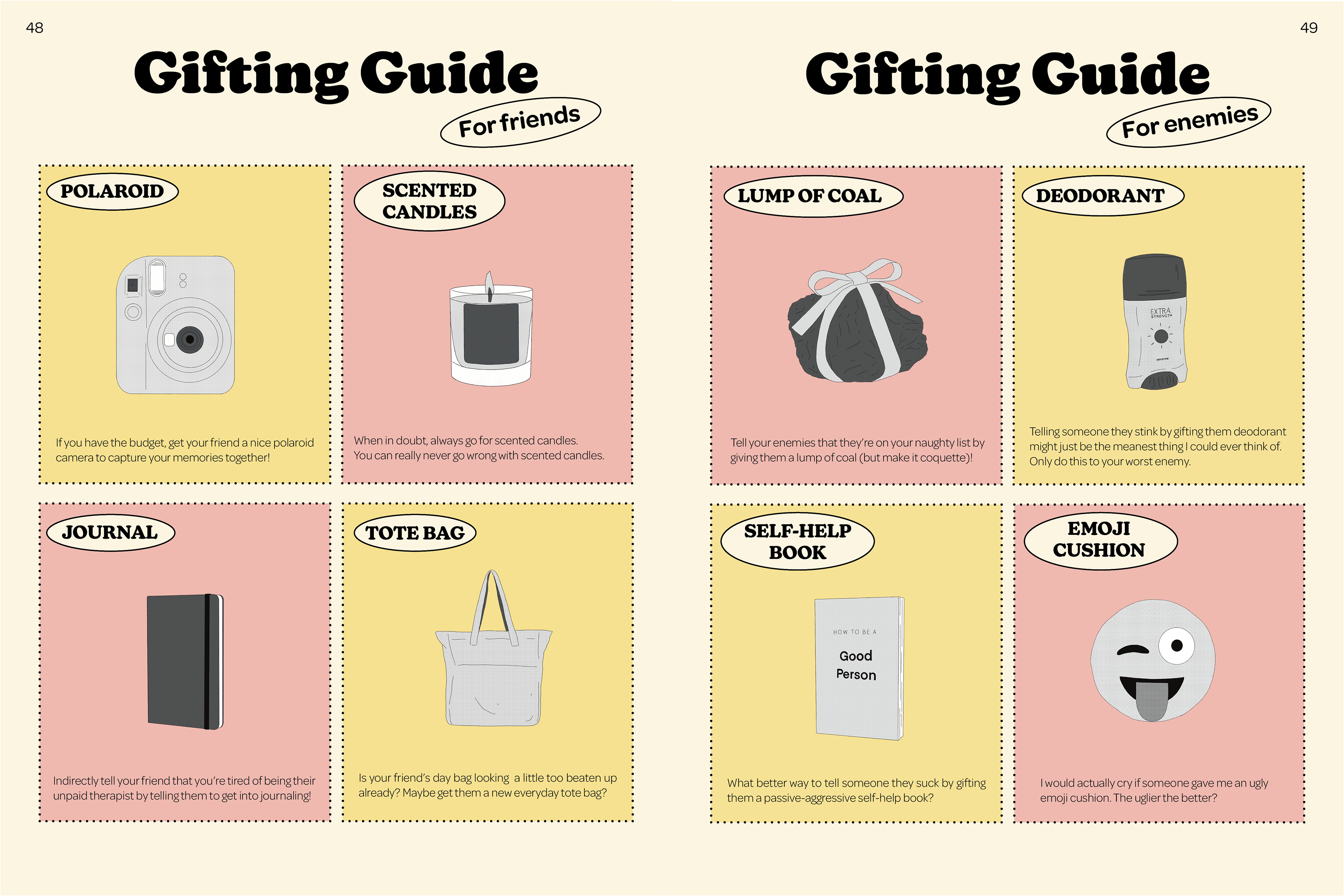
3. Gifting
I was inspired by the look of retro shopping catalogues and coupons for this section and wanted to showcase the gift ideas for yourself, your coworkers, family, friends, and enemies through a shopping catalogue. I stuck to muted pastel colours with the illustrations in black, white and shades of grey with a halftone texture over it in order to give it a more retro, photo-copied look.
To further push the idea of a catalogue brochure, I made the structure of the gifting section resemble a double gate fold brochure, with the ‘It’s Payday!’ page opening up to show the gift guides in a 4-page long spread.
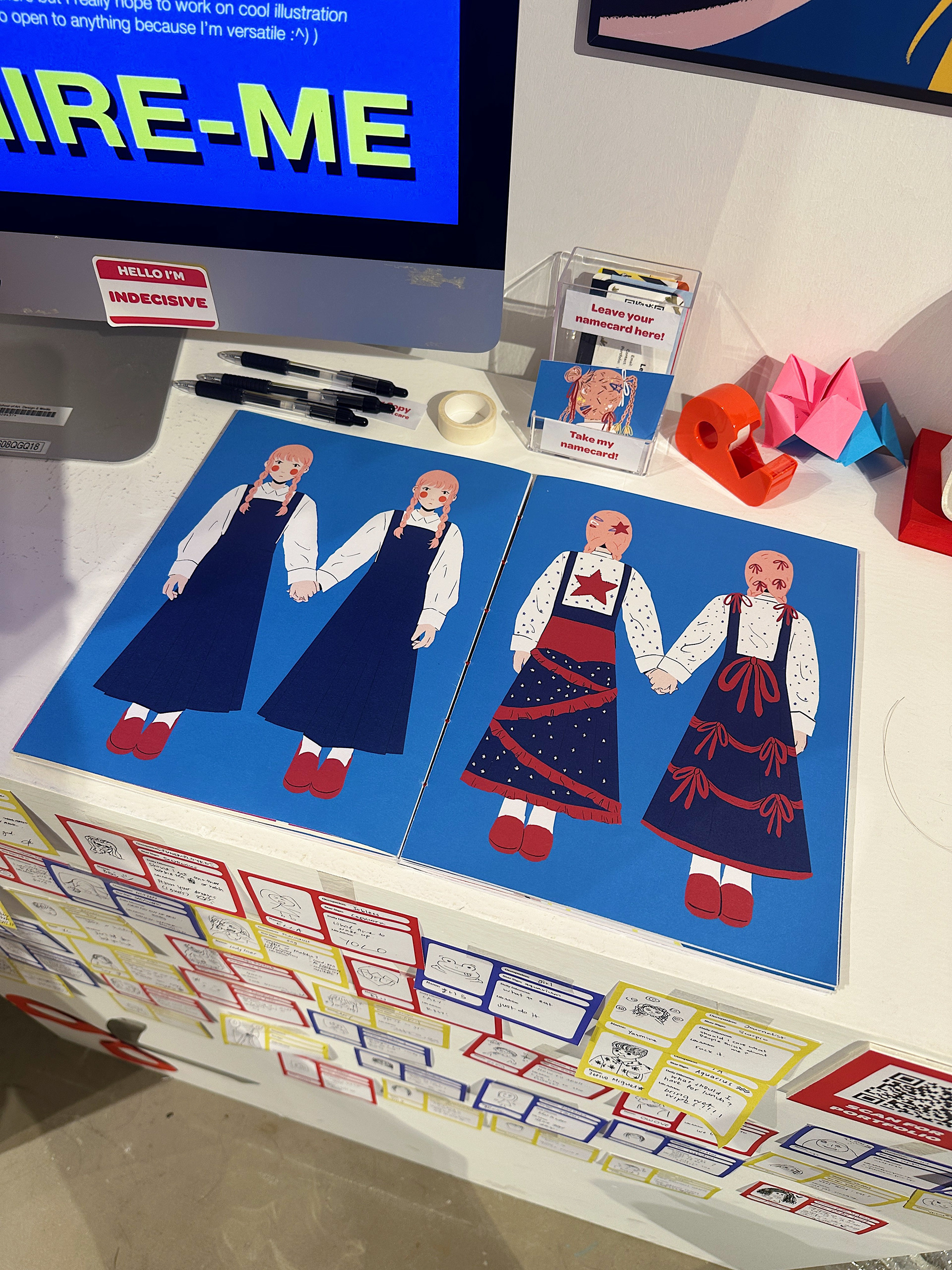
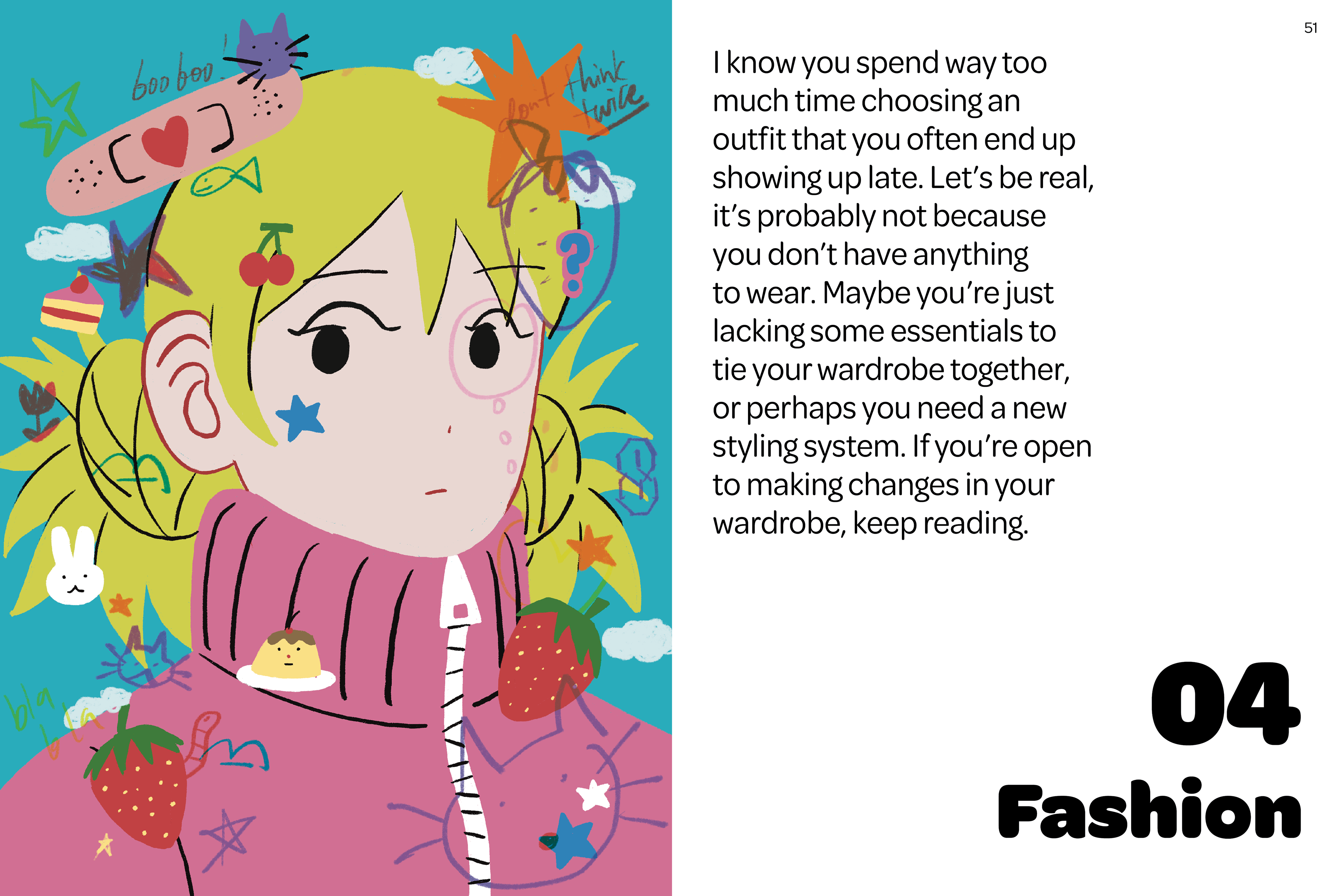
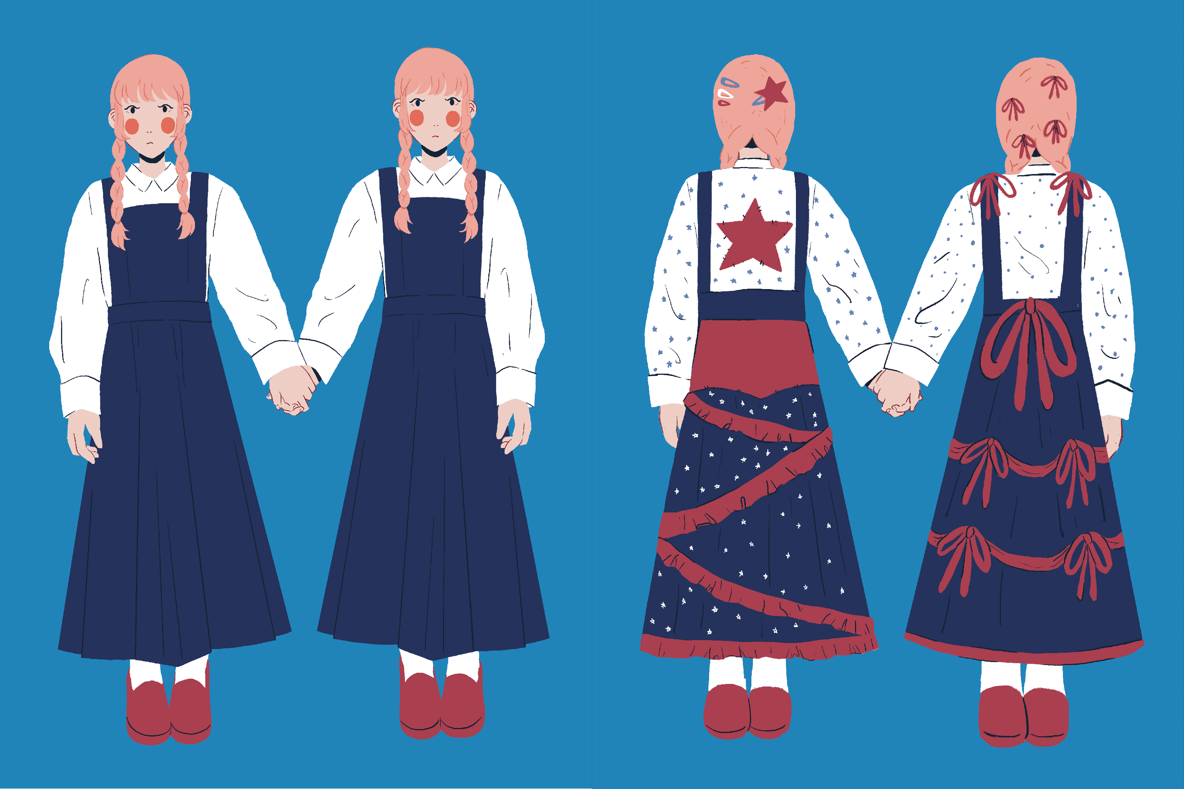
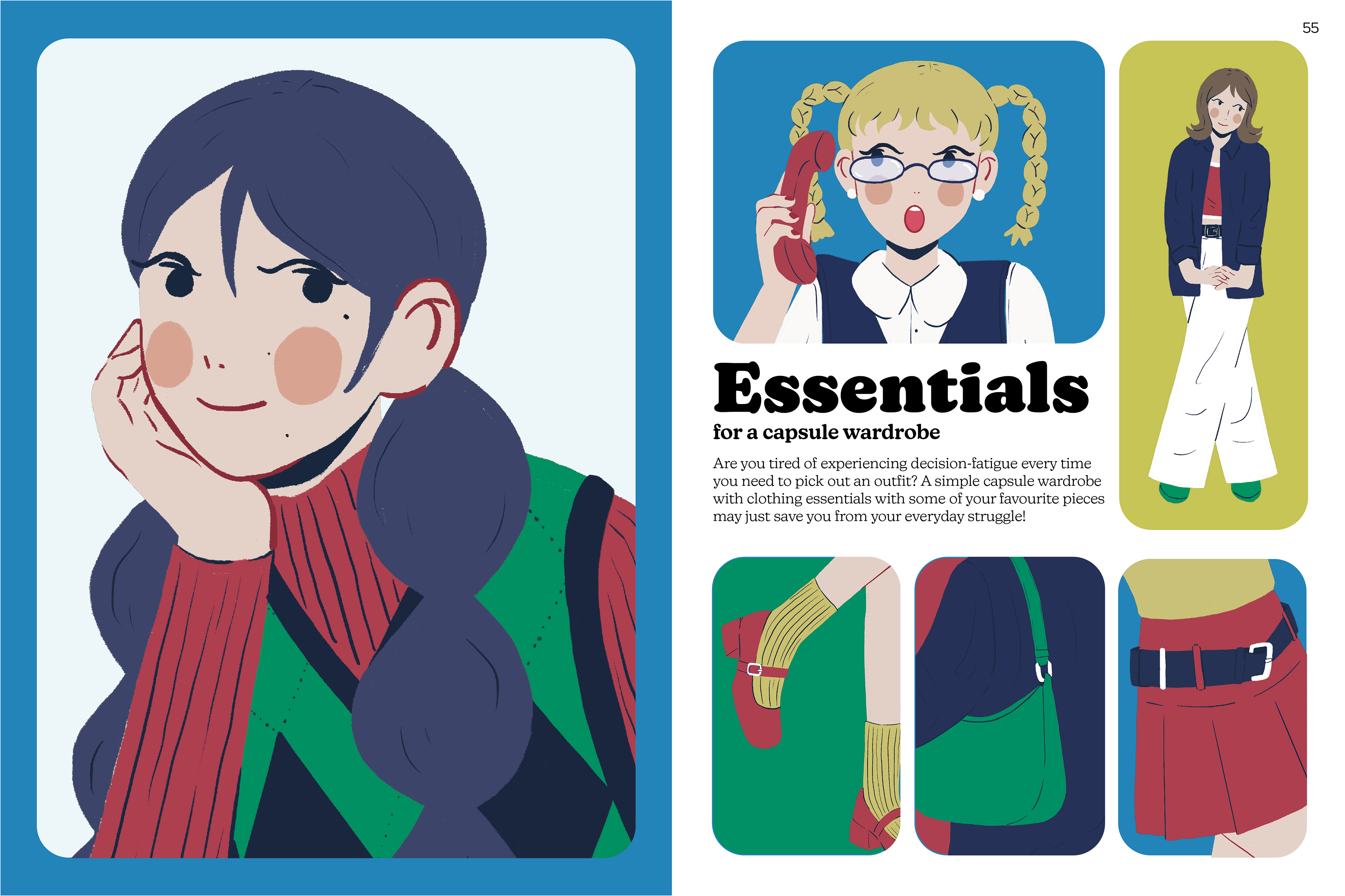
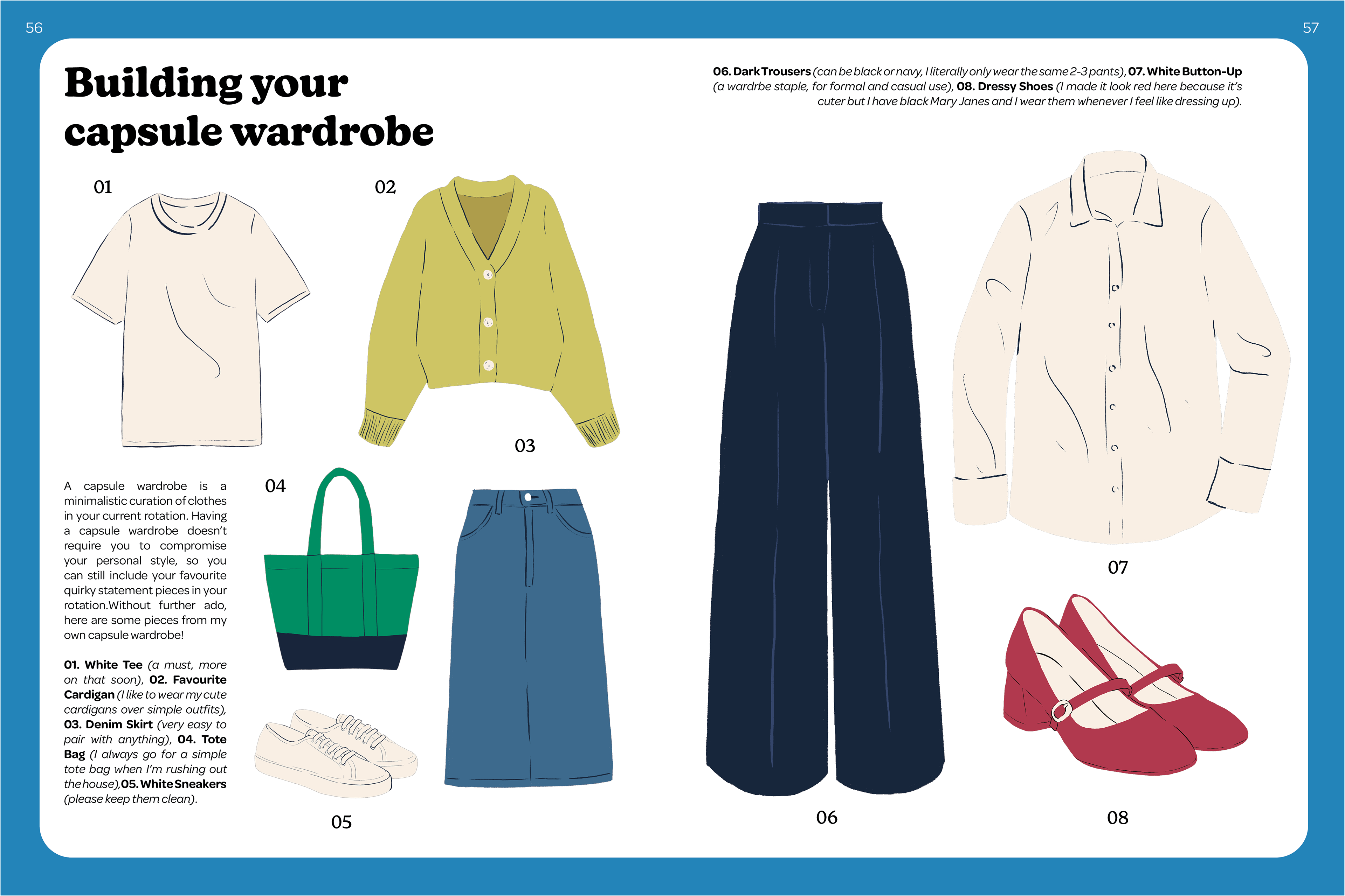
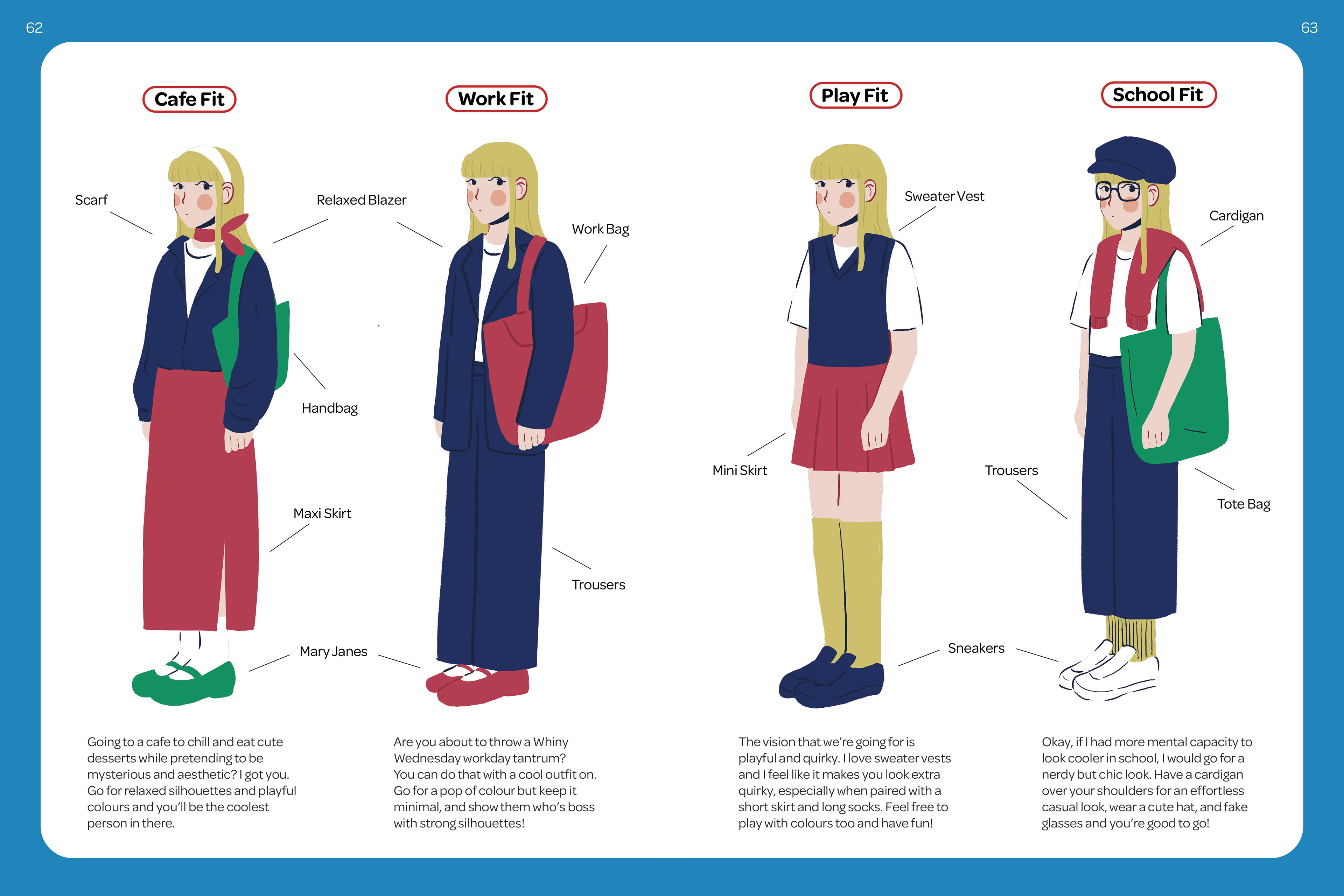
4. Fashion
For the fashion section, I looked at old Japanese teen fashion magazines and was inspired by the paneling and the use of colours. I also wanted the fashion section to have less of a feminine colour palette and more of a neutral one, so I predominantly used blues and reds with muted yellows and greens as secondary colours.
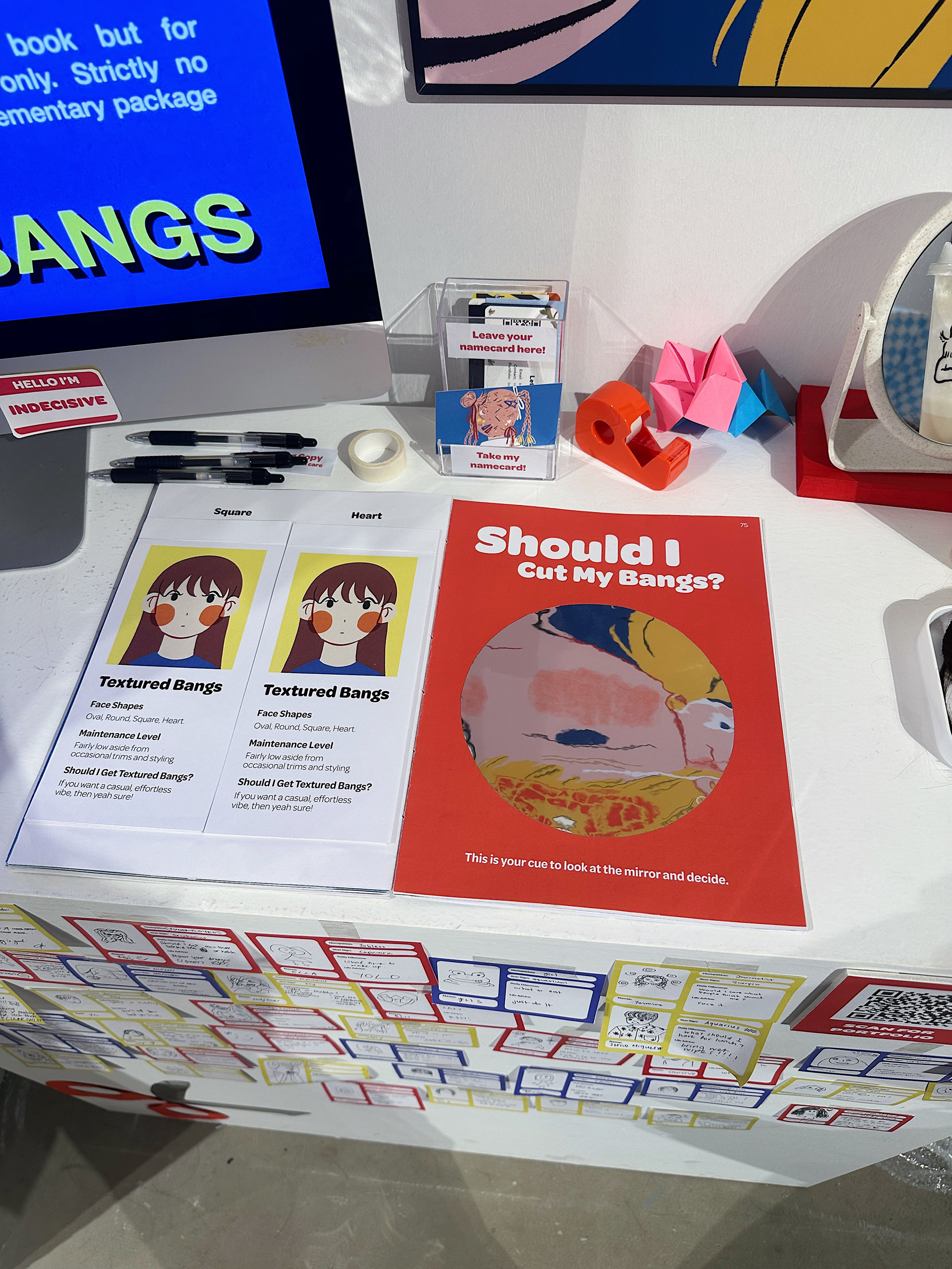
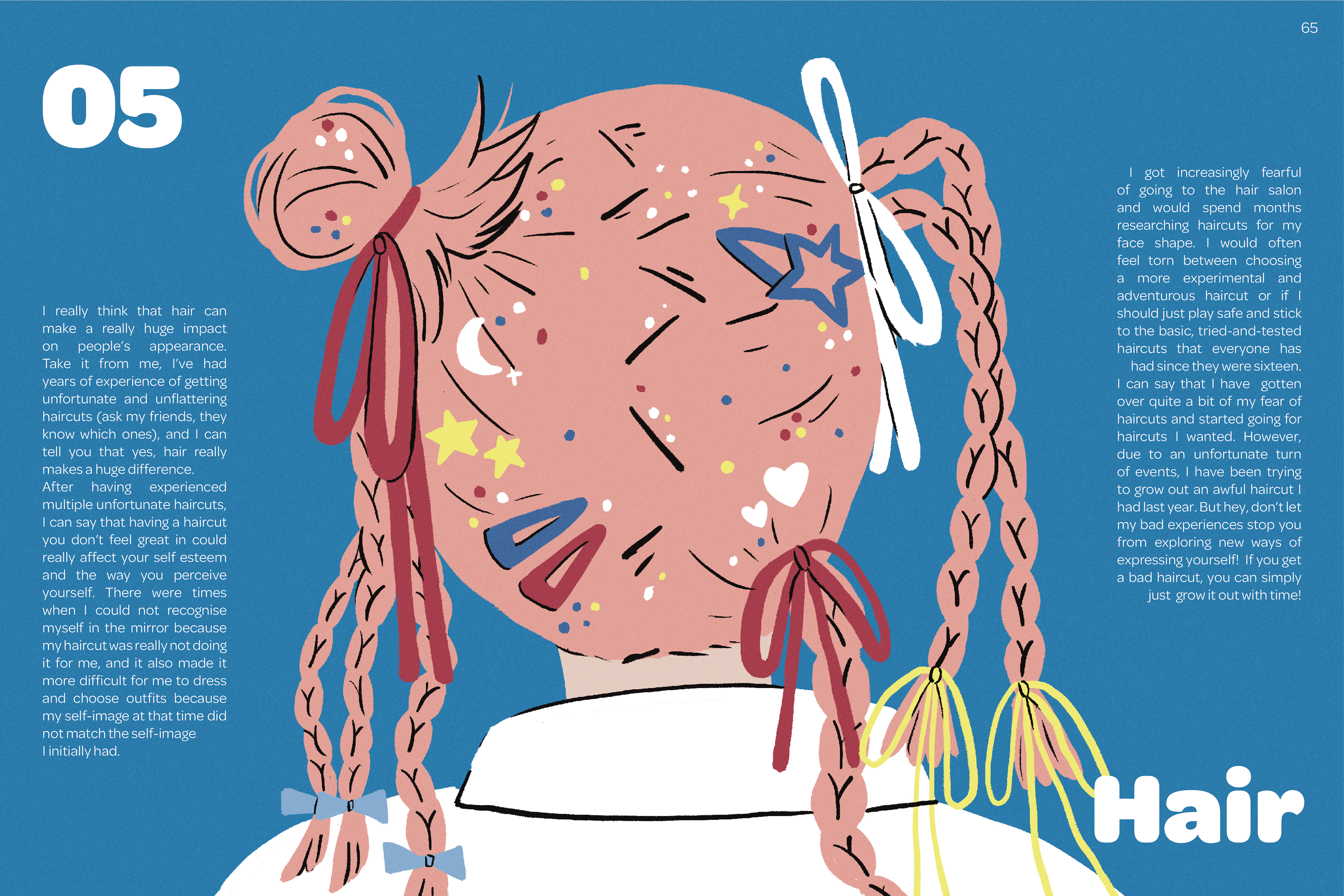
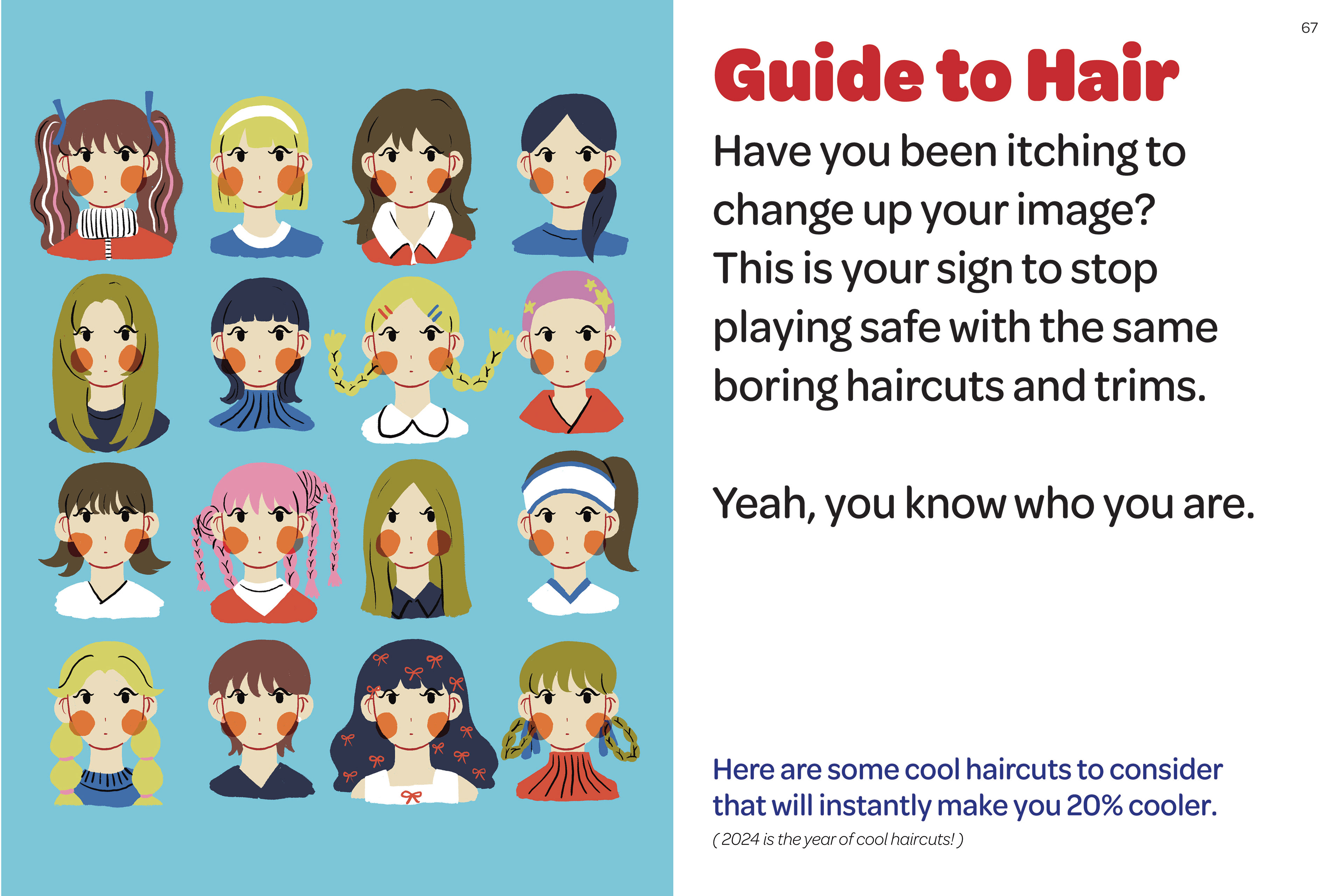
5. Hair
I drew inspiration from maximalist, crazy, hairstyles to convey the idea of indecisiveness in deciding on one style for the section illustration.
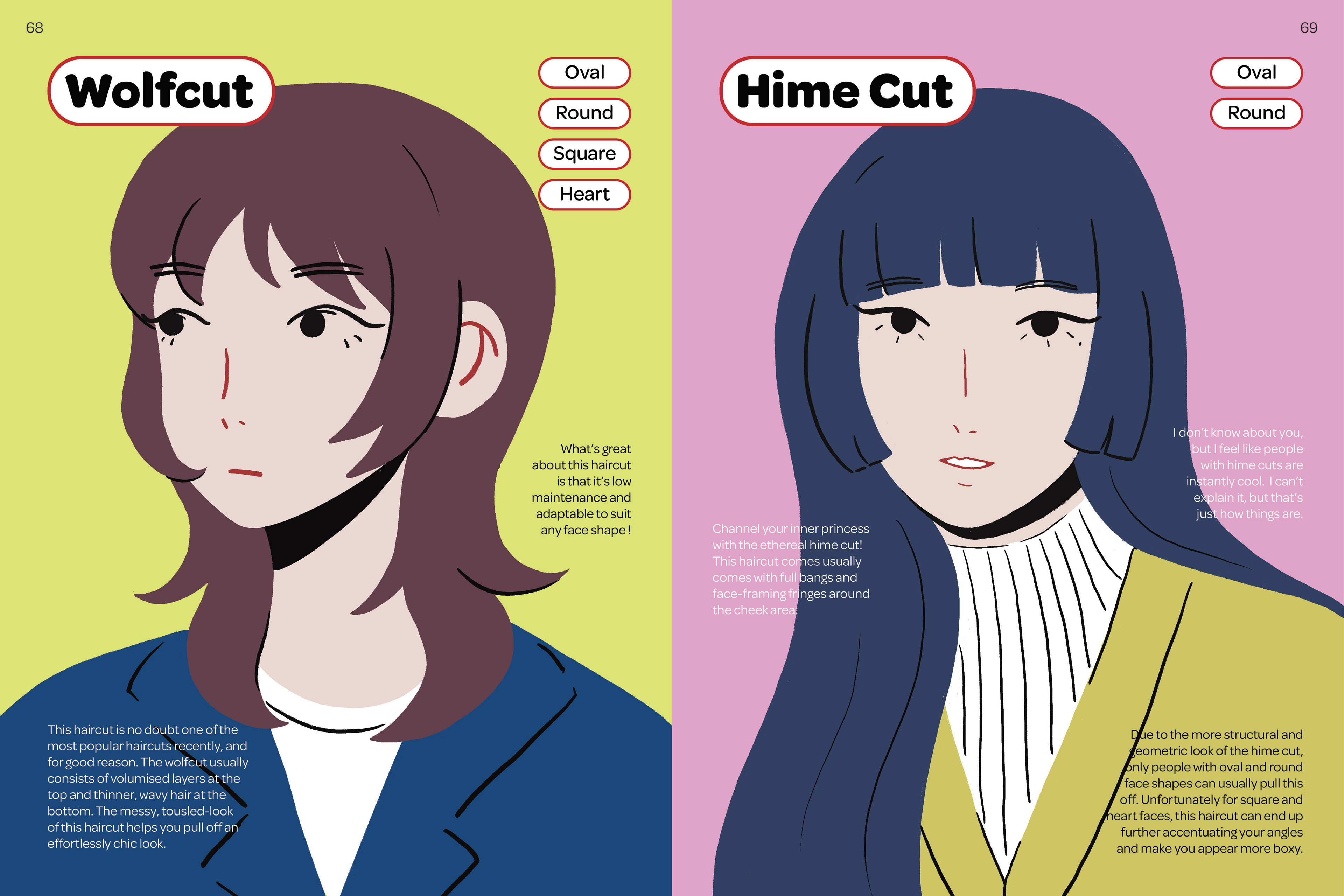
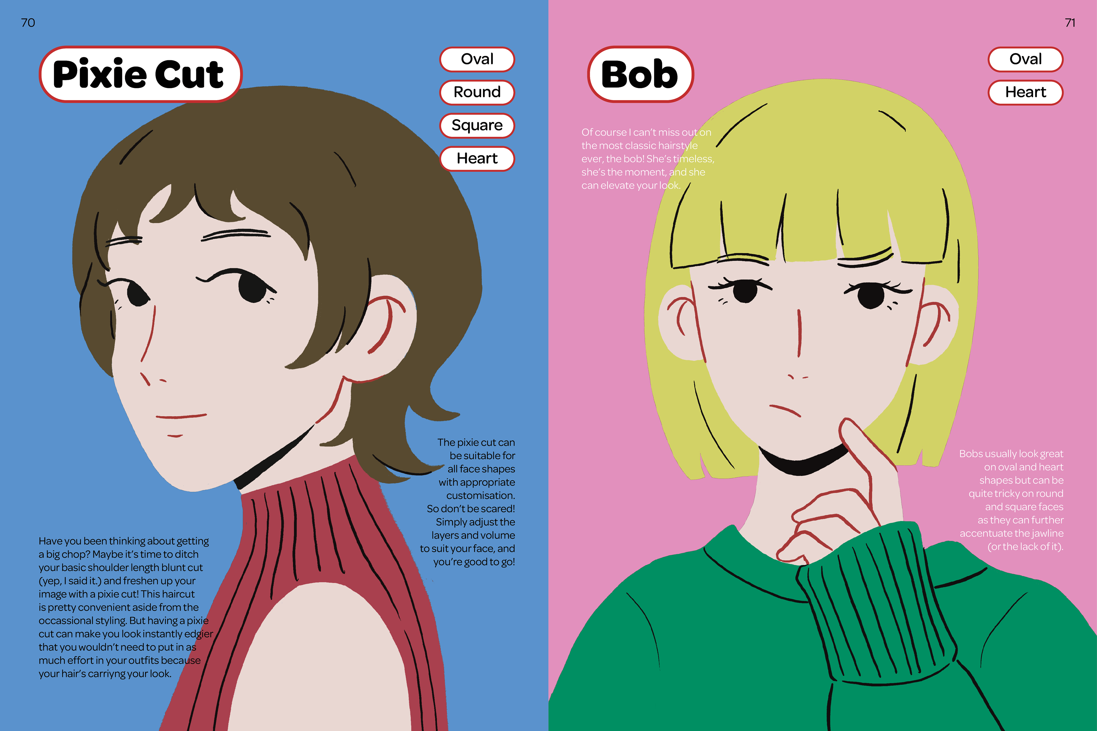
The hairstyle spreads used colours that are a lot more muted to resemble that of retro hair magazines. For the bangs section, I decided to make little booklets to compile the types of bangs suitable for various face shapes. This would allow readers to easily flip through the booklets laid out to see which bangs would work for them, with the page after it having a mirror sheet pasted on so they would be able to check out their reflection.
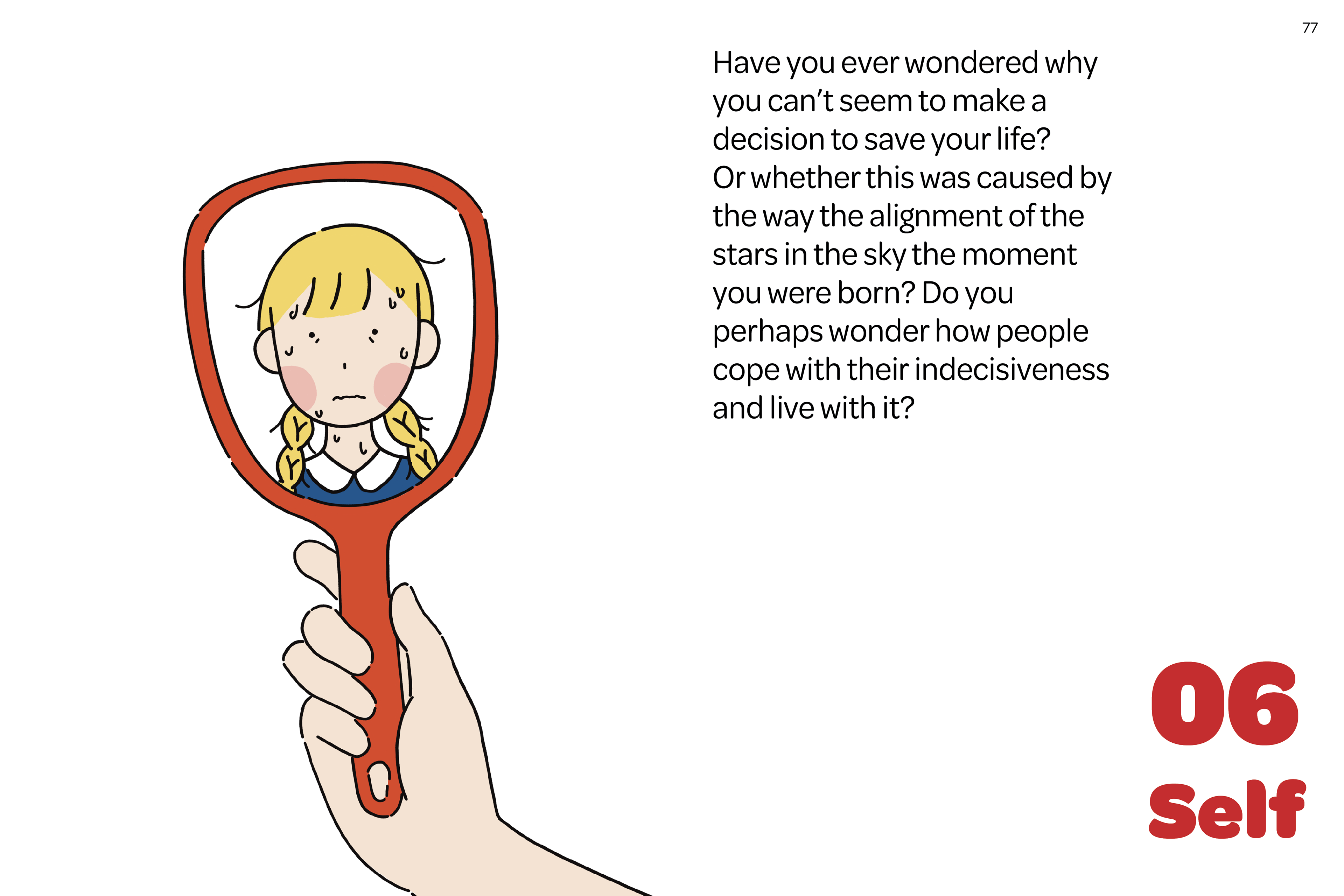
6. Self
I decided to go for a similar treatment for the self section as the introduction section, with a primary colour palette. The illustrations from this section are a lot more simplistic than the rest of the magazine, with line illustrations. Due to this section being some sort of a concluding chapter to end the book, I wanted the visuals and overall layout to look straightforward and clear to show the readers’ reaching some form of clarity at the end of the book.
ADM Graduation Show
Due to the playful and authentic nature of this publication, I decided to hand-sew and hand-bind the book to give it a more full, scrapbook feel. I wanted the book to be able to lay completely flat and decided to go with a combination of coptic and saddle stitch for my book.